

PROJECT PARAMETERS:
PARKOUR is a self-initiated branding and product concept built to address a personal frustration and test my own design thinking. I did not set out to design and build a fully fleshed-out platform or a ready-to-ship product. The goal of this project was to define a problem, seek patterns, validate them through research, and ultimately design a brand system that felt coherent, thematic, and realistic.
*******************************************************************************************
THE PROBLEM:
Parking tickets are an aggravating, expensive, and preventable cost for car owners in big cities.
THE SOLUTION:

An app that keeps track of your parking space for you, alerting you before a parking ticket can be issued.
*******************************************************************************************
Product thinking
CONTEXT
I concluded that my massive parking ticket expense occurred because of a few key issues:
I worked from home
I preferred public transit, rarely driving and never commuting
I parked on the street, rather than in a reserved spot.
Together, these issues made my car too easy to forget about, and when the construction notice went up next to my spot, I didn’t see it until it was too late.

RESEARCH
My problem was personal, but by no means unique. Data from a Squaretalk study shows that in 2022, 16% of companies were fully remote and 40% of companies were on a hybrid schedule. The Chicago Metropolitan Agency for Planning reports that in the Chicago Metropolitan Area, over 50% of commuters do not drive, even if they own a car.
This helps to define a specific user: an urban car owner who parks on the street, but doesn’t drive or check on it every day.
Independent research conducted by Matt Chapman in 2019 found the two top causes for ticketing in Chicago: Expired Vehicle Registration, and Street Cleaning.
Both are the exact kind of penalties PARKOUR would seek to address; predictable, rule-based, and easy to miss.
FLOWS AND WHITEBOARDING
I started by mapping out the core flows of the product, and with the ethos of keeping it simple ended up with three very tight flowcharts. Following this, example screens were whiteboarded in low fidelity.
The most user-involved flow is onboarding, in which the user creates their parking profile. After that, the app works mainly through notifications. Interaction with the app should only occur when parking status changes or user action is needed.


CORE PRINCIPLES
PARKOUR must perform with minimal user input, or else it becomes just another headache to manage.
PARKOUR should address predictable, preventable ticket causes like Expired Registration and Street Cleaning first and foremost.
PARKOUR should eliminate paranoia and stress by running in the background and sending alerts well in advance of potential tickets.
*******************************************************************************************
Branding & Visual Design
LOGO AND ICON
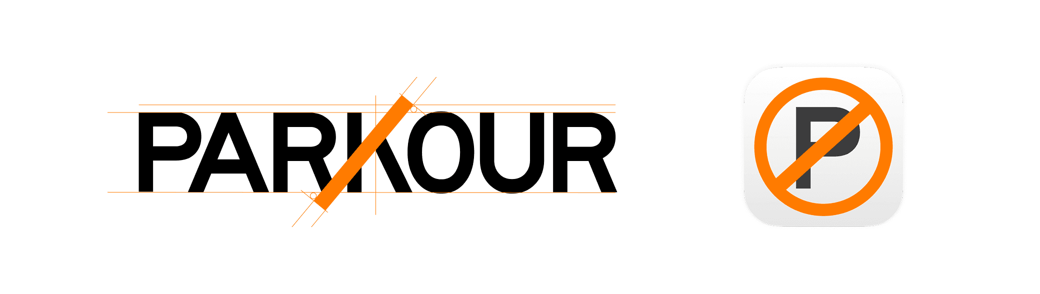
The wordmark and app icon came from an animation study. What if you took the ubiquitous “no parking” sign, and flipped it?
The mark takes a well-understood ubiquitous signifier of restriction and literally inverts it. The result isn’t exactly “no parking,” but it’s not guaranteed parking either.
We end up with a signifier that implies a smarter, safer, and less stressful parking experience.
The same reversed stroke is present and clear in the wordmark, and can animate in and out between icon and full-size logo.
LOOK AND FEEL
I decided to model Parkour's visual language and branding after parking tickets themselves. Mimicking the somewhat alarming, utilitarian feel was natural, given the purpose of the product.
The app provides a warning and reminds users of the consequence of ignoring it. The app itself referenced various parking and transit apps such as Ventra, ParkMobile, and ParkChicago.

TYPOGRAPHY, COLOR
I opted for strong, clean, geometric fonts on all display type. The logo itself uses Highway Gothic Wide, a typeface designed specifically for transit and highway signage. It’s sturdy, legible, and looks more municipal than other geo sans fonts.
Headers utilize Figtree, a digital-forward display font that comes off a bit friendlier than no-nonsense Highway Gothic. Montserrat was chosen for the body copy for legibility and familiarity.
The orange color is of course straight from the brightly colored envelopes that are the subject and object of the entire product.


*******************************************************************************************
How it works
STEP 1:
The user establishes a Parking Profile, setting parameters for safe parking spots within their usual street parking zone.
Input values are matched with publicly available street parking zones. Their parking permit and registration expiration date are logged in the parking profile.
Creating the parking profile is a part of the onboarding process. This sets the user up to receive relevant parking notifications.

STEP 2:
When the user parks, the parking spot is referenced against publicly available city parking zone, street cleaning, and construction permit data.
iOS Apple Maps includes a native service that records a parked car’s location. Failing an automatic record of the parking space, users are prompted by app notifications to confirm their spot.
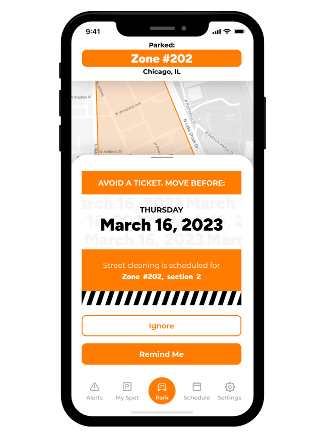
Upon parking, the user is told whether they are parked in a “safe” spot, or if they are at risk for a ticket.

STEP 3:
A notification to move to a new spot is issued before a parking ticket is. A spot is no longer safe, the street has been marked for cleaning, or their registration is a month from expiration.
That’s it. Parkour remembers for you and requires minimal management. It’s a background process, stepping in to quietly remove paranoia, distraction, and costly mistakes.
*******************************************************************************************
REVIEW
Parkour’s current design is a tight, streamlined method of solving a specific problem. It steps in to cover real-life user error and requires minimal user input. It takes advantage of functionality that is stock on iOS and Android and pulls data from publicly available sources.
Parkour was designed with the City of Chicago in mind first and foremost. Further research would be required to determine how its functions would help users living elsewhere, but it’s a reasonable assumption that the causes of parking tickets are similar, no matter where they are issued.
Parkour was a self-initiated concept designed on spec and has not progressed past the design phase. This was an exploration of how brand, interface, and product logic could work together in a cohesive and useful way.