
PARKOUR
UI, UX, Digital, Case Study
Dates: Winter 2022
Role: Solo, Spec
Tools: Figma, Affinity
I first imagined Parkour, or an app like it, after paying the City of Chicago nearly 700 dollars in parking tickets and towing fees. All I had to do was leave my car parked on the street for a week without checking on it. When you own a car in a large city and don’t commute regularly, things like this can happen in a matter of days.
I set out to fully realize my idea for a fire-and-forget app that would eliminate costly mistakes like this from my life forever.
THE PROBLEM
Parking tickets are an aggravating, expensive, and preventable cost for car owners in big cities.
Some of the expenses associated with big-city car ownership, such as parking tickets and late fees, take advantage of the owner's lack of awareness. Getting an unexpected parking ticket is often aggravating and can become expensive.
THE SOLUTION

DODGE EVERY PARKING TICKET.
An app that keeps track of your parking space, alerting you before a parking ticket can be issued.
THE BASICS
The user establishes a Parking Profile, setting parameters for safe parking spots within their usual street parking zone.
01

Input values are matched with publicly available street parking zones. Their parking permit and registration expiration date are logged in the parking profile.
Creating the parking profile is a part of the onboarding process. This sets the user up to receive relevant parking notifications.
When the user parks, the parking spot is referenced vs publicly available city parking zone, street cleaning, and construction permit data.
02

iOS Apple Maps includes a native service that records a parked car’s location. Failing an automatic record of the parking space, users are prompted by app notifications to confirm their spot.
This functionality is also accessible through the app’s home screen. Future designs could incorporate a home screen widget to make this process as streamlined as possible.
Upon parking, the user receives a confirmation that they are parked in a “safe” spot, or if their parking job could be cause for ticketing.
A notification to move to a new spot is issued before a parking ticket is.
03

Users are alerted to move their car for two reasons: Their spot is no longer “safe”, or their city registration is expiring.
That’s it. Parkour remembers for you and requires minimal management. It’s a background process, stepping in to quietly remove paranoia, distraction, and costly mistakes.
THE PROCESS
How did I get there?
I concluded that my massive parking ticket expense occurred because of a few key factors:
I worked from home at the time
When I commuted or traveled within the city, I preferred to use public transit or walk rather than drive
I parked on the street, rather than pay for a reserved garage spot
This confluence of issues meant I checked on my car at irregular intervals, and when the construction notice went up next to my spot, I was unaware until it was too late.

Research
I’m not the only person in a metropolitan area that is vulnerable to tickets due to the factors listed above. Data from a Squaretalk study shows that in 2022, 16% of companies are fully remote and 40% of companies are on a hybrid schedule.
The Chicago Metropolitan Agency for Planning reports that in the Chicago Metropolitan Area, over 50% of commuters do not drive. Those are pre-COVID numbers, by the way.
Finally, independent research conducted by Matt Chapman in 2019 (whose endeavor has a similar origin story to mine) found the two top causes for ticketing in Chicago: Expired Vehicle Registration, and Street Cleaning.
This knowledge reinforced my conclusion that metropolitan car owners often let their cars sit on the streets to accrue tickets without warning. It also revealed the two most ticket varieties, which would be directly addressed by Parkour as a core function.
Key Design Decisions
No Backseat Driving
Parkour must perform with minimal user input, or else it becomes just another headache to manage.

There’s Your Problem
The majority of parking tickets in Chicago are issued due to Expired Registration and Street Cleaning. The product must address these two causes first.

Keep the Meter Running
The old solution to parking tickets is paranoia. Parkour should act as a way of eliminating this by running in the background and sending alerts well in advance of potential tickets.
Flows & Whiteboarding
I started by mapping out the core flows of the product, and with the ethos of keeping it simple ended up with three very tight flowcharts. Following this, example screens were whiteboarded in low fidelity.
Keeping with the initial design decision of minimal user interaction, the most user-involved flow created here is for onboarding. All additional flows are initiated by the app through notifications.

VISUAL DESIGN

Look & Feel

I decided to model the general aesthetic of Parkour after parking tickets themselves. Mimicking the somewhat alarming, strictly utilitarian feel was natural, given the purpose of the product.
The app provides a warning and reminds users of the consequence of ignoring it. The app itself referenced various parking and transit apps such as Ventra, ParkMobile, and ParkChicago.
Colors & Type

I opted for strong, clean, geometric type on all display type. The logo itself uses Highway Gothic Wide, a typeface designed specifically for transit and highway signage. It’s sturdy, legible, and looks more utilitarian than other geo sans fonts.
Headers utilize Figtree, a digital-forward display font that comes off a bit friendlier than no-nonsense Highway Gothic. Montserrat was chosen for the body copy. It’s highly legible and ubiquitous in mobile applications.
The Ticket

I’ve always loved the Metra app’s virtual train ticket - designed to thwart screenshotting through the use of moving elements and tap-activated color changes. I wanted a centerpiece that would serve as the user’s “ticket”, modeled after these utilitarian transit apps.
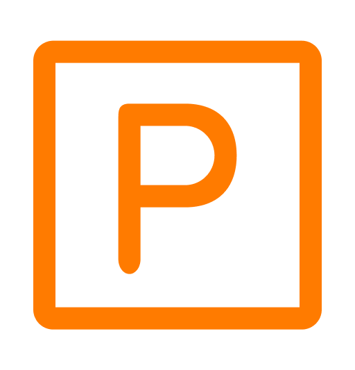
The Icon
The wordmark and app icon came from some animation study. What if we took the ubiquitous “no parking” sign, and flipped it?
Maybe it doesn’t imply “yes parking”, but it doesn’t exactly need to. “Some parking”? That’s closer to what city dwellers experience daily.


REVIEW
Where Did Parkour Land?
Parkour’s current design is a tight, streamlined method of solving a specific problem. It steps in to cover real-life user error and requires minimal user input. It takes advantage of functionality that is stock on iOS and Android and pulls data from publicly available sources.
Parkour was designed with the City of Chicago in mind first and foremost. Further research would be required to determine how its functions would help users living in other metropolitan environments, but I estimate that the causes of parking tickets are similar, no matter where they are issued.
Parkour was designed on spec and has no dedicated development resources. Until then, I’m keeping myself ticket-free the old-fashioned way.